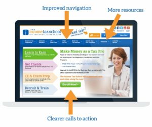
Have you been poking around on The Income Tax School website lately? We unveiled a revamped  website just before Thanksgiving to help guide our current and potential students to the information they need. Our new website is more user-friendly and we’re excited to tell you why!
The user experience is very important. Sometimes it makes or breaks whether or not a website visitor will do business with you. If your website looks unprofessional, if the user can’t find the information he or she is looking for, or if they don’t see the benefit in doing business with you, then you will lose them.
If you are a tax business owner, take note! These changes may be opportunities for you to improve your website in the same way.
Improved Navigation
When a new user visits your site, you need to make sure they can easily (and quickly) find the information they are looking for. The Income Tax School has so many great options for future tax preparers or tax preparers looking to get continuing education, open their own firms, or train new employees. We added more navigation at the top of the page and changed the navigation along the side to make it easier for any visitor to quickly find the information they need.
Clearer Call to Actions and Messaging
Users don’t want to leave your site guessing about the services you offer, how to contact you, or how much your services cost. This is why your messaging needs to be clear and should always end with a call to action to make it easy for the user to take the next step.
We’ve updated all of our calls to action to make it clear what the options and benefits of enrolling in each course are and how much each bundle or course costs.
Lots of Resources
Are there additional resourcs that could help your users? For example white papers or blog posts that could help your clients learn more about the tax industry or filing their taxes in general. Keep your website visitors engaged and coming back to your website by providing valuable resources like blog posts or white papers.
The Income Tax School already has a blog and a great selection of White Papers but we decided that wasn’t enough! We added additional resources to our website as well as a resource tab for users to easily find the resources they need.
Online trends and user habits are constantly changing… and so should your website! Testing new functionalities, changing up your messaging, and adding new calls to actions are all part of fine tuning the user experience.
